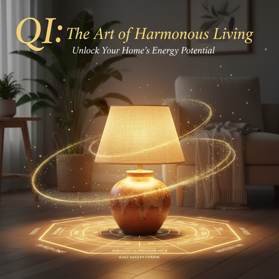
More Than Just Paint
Have you ever walked into a room and felt something was just wrong? The furniture looks fine, but the space feels draining or unwelcoming. Often, the hidden problem is color. In Feng Shui, color isn't just decoration - it's energy that can either help or harm the flow of life force (Chi) in your home.
Are there specific Feng Shui colors to avoid? While no color is completely "bad," certain colors can create problems when overused or used in the wrong places. Imagine trying to sleep in a bright red bedroom or a child living in a room that's all black.
This guide won't give you a scary list of forbidden colors. Instead, we'll help you understand balance and harmony. We'll explore why color choices matter through the Five Elements theory, what colors need careful handling, where placement matters most, and how to create a home that supports your well-being.
The "Why": Five Elements and Color
To master Feng Shui colors, you need to understand their language. This language comes through the Five Elements, or Wu Xing - a system that organizes everything in the universe, including colors, into five connected energy types. Understanding this will help you make better decisions beyond simple color matching.
What are the Five Elements?
The Five Elements are Wood, Fire, Earth, Metal, and Water. Each represents a different type of energy and connects to specific colors. They are the building blocks for creating balance in your home.
Cycles of Harmony and Discord
The Elements interact in two main ways: the Productive Cycle and the Destructive Cycle. Understanding these relationships helps you fix color imbalances.
- The Productive Cycle shows how elements create and support each other:
- Water helps Wood grow
- Wood feeds Fire
- Fire creates Earth (as ash)
- Earth produces Metal
-
Metal carries Water
-
The Destructive Cycle shows how elements control each other:
- Water puts out Fire
- Fire melts Metal
- Metal cuts Wood
- Wood breaks up Earth
- Earth blocks Water
How Colors Connect
Every color in your home carries the energy of one of the Five Elements:
| Element | Colors | Energy/Association |
|---|---|---|
| Wood | Green, Brown | Growth, Vitality, Healing |
| Fire | Red, Strong Orange, Purple, Pink | Passion, Energy, Expansion |
| Earth | Light Yellow, Sandy/Earthy Tones, Beige | Stability, Nourishment, Grounding |
| Metal | White, Gray, Metallics | Clarity, Precision, Logic |
| Water | Black, Dark Blue | Stillness, Wisdom, Flow |
The Core List: 7 Colors to Use Carefully
Now let's look at specific colors that often cause energy problems. Remember, these aren't "forbidden" - just use them thoughtfully.
1. Overly Strong Red
Red is a Fire element color representing passion and luck, but it's very powerful.
- Why to Use with Caution: Too much red can cause anxiety, anger, and burnout. It's exhausting to live with day after day.
- Where to Avoid: Don't use lots of red in bedrooms - its active energy fights against rest. Also avoid it in meditation areas and the East (Health & Family) area.
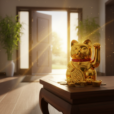
- When It's Okay: Small red accents work well to activate energy. Try a red vase in the South (Fame) area or red cushions in the Southwest (Love) area.
2. Expansive Black
Black is a Water element color representing depth and sophistication, but it absorbs energy.
- Why to Use with Caution: Large black surfaces can create depression and heavy energy. It makes spaces feel smaller and can absorb positive Chi.
- Where to Avoid: Don't use black in children's rooms or on ceilings. Also avoid it in the South (Fame) area, as Water puts out Fire.
- When It's Okay: Black makes a great accent color in frames, furniture legs, or patterns. It works best in the North (Career) area.
3. Unbalanced White
White represents the Metal element, meaning clarity and new beginnings, but not all whites are equal.
- Why to Use with Caution: Stark, clinical white in large spaces feels sterile and lonely. It lacks warmth and can create harsh glare.
- Where to Avoid: All-white schemes can be problems in bedrooms or family rooms without soft textures. Avoid too much white in East (Family) and Southeast (Wealth) areas.
- When It's Okay: White works well in kitchens and bathrooms. Creamy whites and layered whites create sophisticated looks. Balance is key.
4. Murky or "Sad" Grays
Gray is another Metal element color that's popular, but the specific shade matters.
- Why to Use with Caution: Dull, flat grays with no undertones can create feelings of stagnation and sadness, draining a room's energy.
- Where to Avoid: Avoid these sad grays in the East (Family) area and in creative spaces like home offices.
- When It's Okay: Lighter, warmer grays with beige undertones can be sophisticated. Use gray as a backdrop in the Northwest (Helpful People) area.
5. Anxious Yellow
Yellow is an Earth element color for stability and cheerfulness, but its high energy can become too much.
- Why to Use with Caution: Bright, acidic yellows stimulate the nervous system, causing anxiety and irritability. Studies show babies cry more in bright yellow rooms.
- Where to Avoid: Avoid harsh yellows in bedrooms, nurseries, and study areas where calm is needed.
- When It's Okay: Soft, buttery yellows are welcoming in kitchens and dining rooms. They work well in the center of your home for grounding.
6. Immature Greens
Green is the Wood element color for growth and healing, but artificial shades miss the mark.
- Why to Use with Caution: Artificial greens like lime or minty green can feel unsettling and cheap rather than healing.
- Where to Avoid: Avoid unnatural greens in serene spaces like formal living rooms, master bedrooms, or meditation areas.
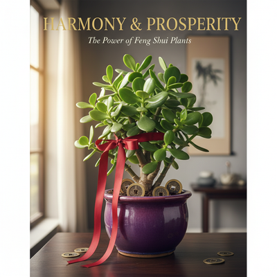
- When It's Okay: Natural greens from deep forest to soft sage are beneficial. Use green in the East (Health) and Southeast (Wealth) areas. Living plants are the best way to add green.
7. Overly Dark Blues
Dark blue is a Water element color promoting calm and wisdom, but too much lowers energy.
- Why to Use with Caution: Large areas of dark blue, especially with little natural light, can create sadness or depression. It slows energy flow.
- Where to Avoid: Dark blue may suppress appetite, making it poor for dining rooms. It also clashes in south-facing rooms.
- When It's Okay: Dark blue works well in meditation spaces or studies, especially in the Northeast (Knowledge) area. Use it as an accent rather than the main color.
A Real-World Transformation
Let's see how color changes can transform someone's life, like our client Sarah's experience.
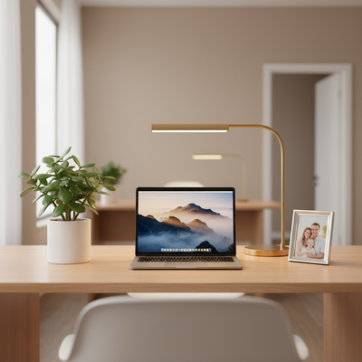
The Problem: Stagnant Home Office
Sarah, a graphic designer, felt creatively blocked and unproductive. Her "minimalist" home office felt cold and draining, and her business had stalled.
The Diagnosis: A Clash of Elements
Her office had stark white walls and a massive black desk. Located in the East sector (Family & New Beginnings), governed by Wood, her colors created problems. The white (Metal) was "chopping" the Wood energy, while the black desk (Water) was creating stagnant energy. The room lacked Wood's vitality and Fire's creative spark.
The Solution: Injecting Life
We recommended:
* Repainting the main wall a soft sage green to support the Wood element
* Adding a cork board (Earth element) for grounding
* Including small red accents (Fire element) to spark passion
* Replacing the black desk with a natural wood one
The Result: A Thriving Workspace
Within days, Sarah felt more inspired and focused. Her creative block lifted, and within a month, she landed two major clients. Her story shows how color directly impacts success and well-being.
Debunking Common Myths
Let's clear up some confusion about Feng Shui colors:
Myth #1: "This Color is Always Bad"
No color is inherently bad. The problem is imbalance, proportion, and context. A touch of black adds sophistication; a room that's all black is oppressive. A room with 90% beige and 10% red accents can be dynamic and balanced.
Myth #2: "You Must Use a Bagua Map"
While the Bagua map is powerful, beginners can start by considering room function:
* Bedrooms need calm colors like soft earth tones
* Kitchens need clean, uplifting colors like whites and soft yellows
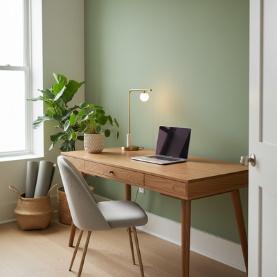
* Home offices need supportive colors like earth tones with touches of fire
Myth #3: "One-Size-Fits-All Advice"
True Feng Shui involves personalization. Professional consultations consider your personal Kua Number based on birth date and gender to reveal your supportive elements. Someone with strong personal Fire might need less red and more Earth and Metal colors for balance.
Your Action Plan: Color Audit
Don't feel overwhelmed. Start with a simple audit:
-
Step 1: Choose One Room. Start with the room you use most or that feels "off."
-
Step 2: Identify the Dominant Color. What color catches your eye first? This drives the energy.
-
Step 3: Assess the Feeling. Sit in the room for five minutes. How does the color make you feel? Anxious? Drained? Sad?
-
Step 4: Identify the Imbalance. Is there too much Fire? Metal? Water?
-
Step 5: Make One Small Change. Follow the 10% Rule - change just 10% to shift energy:
- For too much fire: Add earth-toned pillows or ceramics
- For too stark metal: Add a green plant or wooden frames
- For too dark water: Add metallic lamps or a white throw blanket
Conclusion: Embrace Harmony
The purpose of Feng Shui color isn't following rigid rules but creating a home that supports your energy. Remember: balance is the goal, context matters, and proportion is your tool.
Trust your intuition. Feng Shui principles provide a map, but your feelings are your compass. The best home feels supportive, nurturing, and joyful to you. With mindful color choices, your living space becomes more than shelter - it becomes a powerful engine for growth, health, and happiness.